An Introduction to Heritage and Authenticity
This is an introduction to the key concepts and central arguments of my 2018 masters thesis Distilling Authenticity: An Analytical Approach to Heritage Branding, adapted in part from my defense script.
Approaching Branding as Visual Culture
My intention in going back to school was to gain marketable skills that could be supported by my historical and theoretical understanding, and to marry all of that with food, beverage, and restaurants in pursuit of a niche for myself. Early on I found an interest in branding and a lot like the pop artists, I was fascinated on a deeper and more human level by these nebulous entities made up of symbols and ideas that make up our modern world. If logos and packages and advertising are the “new realism” then they can be analyzed like any other work of art or culture, and we probably should be doing that because the messages we put into the world, visual or verbal, overt or subtle, do matter.
While studying art history as an undergraduate at Loyola University Chicago I was reading a lot of comics and had a lot of friends to talk about them with, and having a lot of access and personal investment in that topic influenced me to write my thesis about Pop Art and Roy Lichtenstein. I started working at Big Star in Chicago a little while before enrolling at Harrington College of Design, and that job ended up carrying me through graduate school in more ways than one. Naturally, as I worked my way through school and started thinking about my masters thesis I gravitated towards a topic that I was privy to outside of my studies.
While I have all these ideas about design and visual culture in my head, I’m also attending spirits education sessions for Big Star staff, mainly about bourbon whiskey. Several times a year brand ambassadors from different distilleries would come to speak to us, give us a guided tasting of their spirits, and talk in-depth about what makes their spirits special and different from all the others. During these bourbon classes I started to notice something: besides the tasting itself, the conversation would inevitably turn towards the character of each brand and how the names, verbiage and imagery on each brand’s bottle tell a particular story. Many of these brands date back to the turn of the 20th century or earlier with very few changes to their branding over time, many bear the names of historical or legendary figures, and they all consider themselves to be carrying on American heritage, crafting America’s native spirit. This is when I really became interested in bourbon as more than just a drink. For someone just beginning to learn about spirits and American whiskey in particular, I was compelled by the way that certain brown booze was differentiated from other brown booze. Unless you have had the time, money, and access to become familiar with different distilleries and mash bills and whatnot, the branding and packaging are your guidepost to picking the spirit you want to drink. Even those with more knowledge, like service staff for instance, use the branding and packaging to color their understanding of each spirit and help them make recommendations and sales. As I thought more about my thesis I also saw bourbon whiskey as a topic that was contained enough to make for a good in-depth analytical study. I was Charles Darwin and bourbon was my Galapagos.
And so, I spent my thesis doing intensive research on bourbon, branding, and the histories therein, and found that historical American bourbon brands could tell designers something very important about how to build an “authentic” brand when working with historically and culturally significant subject matter. In particular, what I found is that the current rote framework for designing a brand, taught to graphic designers and communications professionals, does not allow for the rigorous consideration of historical and cultural context.
Defining Poorly-Defined Buzzwords
During my research, I had to settle on definitions for a lot of this nebulous language that originally comes from marketing people so that I could treat them with academic consideration. A definition I like for branding comes from Seth Godin: “The set of expectations, memories, stories, and relationships that, taken together, account for a customer’s decision to choose one product or service over another.” My area of interest is usually visual branding, that is, the visual expression of brand. Another concept I reference a lot is value proposition, that is, an innovation, service, or feature intended to make a company or product attractive to customers.
In marketing and rote graphic design, “heritage branding” has become a buzzword, largely undefined, to seemingly refer to anything vintage-y or old time-y and so engineering a definition that I could work with was crucial. I define heritage as something acquired from or transmitted by a predecessor, and a heritage brand as a brand that offers a value proposition and a differentiation from other products in its class based on its heritage. A good general example of a heritage brand would be Morton Salt. Make no mistake, we buy Morton salt because we know the Morton Salt Girl very well and have for about 100 years. If you go to mortonsalt.com/heritage you can read all about the history of their company and their iconic branding. Heritage brands use historical and cultural context to give clarity to the brand’s message, and shape customers’ perception by enriching their understanding of the product, the company, its origins and traditions. However, the most important part of a heritage brand’s approach is its ability to back up its claims to heritage with demonstrable historical fact. Which Morton totally can.
Authenticity is another buzzword, that seems to mean everything and nothing when invoked by marketers. During my research into branding I found this eloquent definition for authenticity from Alina Wheeler: “self-knowledge and making decisions congruent with that self-knowledge.” For my purposes here, I went a little deeper with my definition because my concern is specifically with the visual expression of authenticity through design. Authenticity is about promises being kept. That is, does the product or service deliver on the explicit or implied promises that the visual elements make? Does the brand’s visual expression align with the facts?
Back to Bourbon for a Moment
What’s interesting about bourbon is that heritage has been an important part of its branding since at least the 1800s. In The Social History of Bourbon, Gerald Carson says that after the Civil War many smaller bourbon distilleries and brands changed hands. The new firms that owned these brands evoked the heritage of the bourbon industry in the United States to assure their customers of their respect for the old processes and recipes. Bourbon distillers also often evoked the old world custom of a family following a craft. Even smaller distilleries could compete against bigger brands like Jim Beam by selling heritage as part of the product.
Just a little while after that the bourbon industry started selling bourbon in uniform consumer packaged bottles. Bourbon sold in bottles could be sealed, sold under a proprietary name, and have its integrity guaranteed by the US Government. Bourbon distillers were also at the forefront of the effort for labeling laws, leading to the Pure Food and Drug act of 1906. This concern for authenticity came from the very real need to protect consumers from counterfeiting and adulteration.
All of these historical aspects are reflected in the symbols and traditions and design conventions that we associate with bourbon, whiskey, and to some extent spirits at large, to this day. These design decisions were originally made in the service of authenticity above all else. As I said at the beginning, the current framework for designing a brand does not provide for a rigorous consideration of historical fact. It serves design, but it does not serve authenticity. Therefore, bourbon whiskey brands are a great place to analyze what design that serves authenticity looks like and backwards-engineer a way of thinking about authenticity first and design second.
In my thesis, I used ideas from semiotics as a way to potentially chart authenticity, but the crux of that area of my studies was isolating four categories from which all heritage brands derive their heritage, in varying degrees. These are product, process, company and brand. In terms of bourbon: Product would be the spirit itself and the recipe, process would be the craft of distilling, company refers to the lineage, history, or “pedigree” of the company itself, and brand is the visual expression of the brand as logo, packaging, or what have you. To create a heritage brand with authenticity, a designer must start with a clearly defined area of authenticity to work within by finding the true heritage within one or more of those four categories.
Translating Heritage through Intuition
Before we had graphic design as we know it today, and well before the inception of branding and corporate identity, the craftspeople who defined brands like Jim Beam relied on intuition. Not guessing, but intuition formed by an understanding of their craft. Designers actually rely on our intuition quite a bit, we often couch this in words like “taste,” but ultimately it’s an intuitive sense of what looks right informed by our knowledge as modern craftspeople. So if we can create authentic brands by defining the area of heritage to draw from and then using our intuition to authentically express that heritage, I would conclude that authenticity comes from heritage, translated by intuition.
Truthfully telling a brand’s story and being respectful to history and culture is the right thing to do, but of course that is not enough reasoning up front for the businesspeople in our world. Luckily, to put it bluntly, lying can be prosecuted in a court of law and cost the aforementioned businesspeople a lot of money that could have been saved if they cared enough about culture from the jump.
Authenticity can specifically be about truth in advertising, legally. After all, much of what graphic designers end up doing is advertising, and by neglecting the authenticity of your message you could find yourself in a real bind. Like Templeton Rye, which claimed to be a small batch prohibition-era recipe from Iowa, until class action lawsuits came down on them for “deceptively marketing” their whiskey. In addition to compensating customers, Templeton was required to remove the verbiage “small batch” and “prohibition era recipe” from its label, and add the words “distilled in Indiana” to clear up any remaining confusion.
Faking authenticity can be a costly mistake, and an arguably unethical one. So maybe this is really all about ethics. It’s not just that designers can create more authentic brands with this approach, but that designers can create more ethical brands. Visual branding that speaks with a historical voice and indicates heritage implies authenticity. Loading a brand with the symbols of heritage in an inauthentic way is at best misleading and at worst a liability.
If the function of a brand is to help customers make a decision, using heritage branding in the absence of actual heritage misrepresents the facts about a product for the sake of design, which is unethical. Bourbon distillers originally used branding to assure their customers of their product’s quality and their distillery’s dedication to the craft. Consumers should not have to worry about feeling duped by folksy-looking branding and tall tales, consumers should be able to trust that brands are sending them authentic messages. Designers, as creators and curators of visual culture, have an ethical obligation to use our skills and intuition to preserve cultural heritage and champion authenticity.
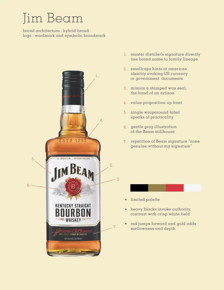
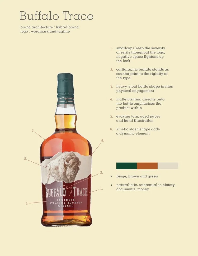
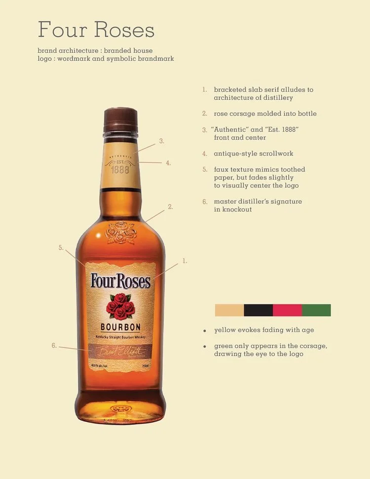
Graphics showing analysis based on visual branding case studies. Click to see full size images.
Selected Sources
Designing Brand Identity: An Essential Guide for the Whole Branding Team by Alina Wheeler
The Social History of Bourbon by Gerald Carson
Bourbon: The Rise, Fall & Rebirth of An American Whiskey by Fred Minnick


